Andrzej Ogorek
December 31, 2018
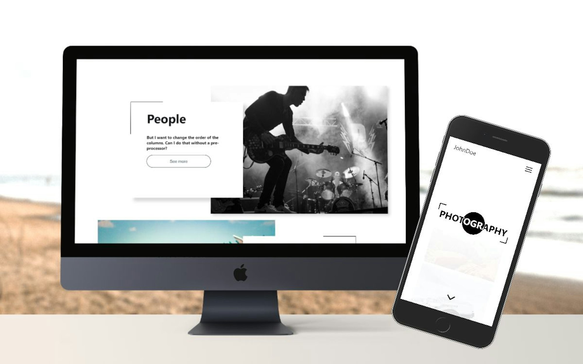
In this tutorial I'm going to demonstrate how to build a photography portfolio website using React, Styled-Components and Cosmic. Let's get started.
TL;DR
View and install the demo
View the code on GitHub
Intro
Cosmic provides a good backend for your webapps. It is a fully-featured content management system (CMS) with numerous options that allows everyone on your team to collaborate to manage content. Cosmic provides many options for developers: Bucket Admins can assign different roles for their team members, create single or multiple relationships between Objects and much more.
In this example I use:
- the multiple objects relationship metafield
- images / files
- default objects input
ReactJS: easy and flexible JS library to create a client side app. The React CLI allows you to create single page apps with no configuration.
StyledComponents: alternative for Static CSS, allows you to build separate components to enhance your app and make it expandable.
Getting Started
1. In your Cosmic dashboard click "Add New Bucket".
1.1 Install an App - Install an App button, assign the application name and "Save Bucket". After that, select the application from the list of applications and click "Install free". And you created all the objects necessary for the application. The last thing to do: Copy the API key from the Cosmic desktop> Basic settings> Bucket slug.
1.2 From Scratch - start from scratch button, assign the application name and "Save bucket". For this app, you need to create three objects type. Images, Categories and Sites.
Images: Default inputs plus additional metafields called: "img" as image/file object type checked as required.
Categories: Default inputs plus extra metafields called: "images" as multiple objects relationship (select limit Search by Images) and Image/file object called: "img".
Sites: Default inputs type plus additional metafields called: "picture".
I've created the Bucket for my application, and am now ready to dive into the code. Link for your Bucket Slug.
Code
Clone the repo from Github or you can create from scratch. This package shows all dependencies used for app:
After you've installed React and all dependencies, you are ready to write code.
All data is downloaded separately, a parameter is sent in the react-router. After moving to a single post, a single element is fetch and rendered in component.
A brief explanation about the file structure.
- Our first task is to create a file structure for the project.
App.js default , folder component:
buttons (all created buttons),
headers (all headers),
page (all page),
parts (all stateless only const styled components),
section (class and functional components that manage data and import other component from parts file),
layout (app layout global style theme provider).
utils (color and theme object).
What's Inside
App.js file that is located routing and layout import, state for interactive elements. Here we pass data that we can pick up in another component as props.
Section
Category.js is rendering as a home page. This displays data downloaded as props from the app.js component. It also imports styled components from the "parts" folder.
PartGrid.js - state component collects data from Cosmic. The page with photos in the selected category contains a link to a single photo.
Single.js - It is also a component containing state. Receives data for a single photo from Cosmic.
Layout.js - contains theme provider and global style. Since we used the theme provider, we can connect CSS with React and use CSS variables depending on props from the component.
Nav.js - separate state component with own styled-components and state.
Parts
In this folder there are only single tags HTML styling in CSS (styled-components) and exported as separate components.
Buttons and Headers
Individual HTML tags styling in styled-components): h1, button etc.
Page
Contact.js - State component that fetch data from Cosmic and display in app.
Utils
All global variables that we can use in our app like colors, media query, font-size etc. Variables from the files we can pass as props to other components and use in styled-components.
Conclusion
We've just created a simple app using styled-components, React JS and Cosmic. At the beginning we saw how to create the Bucket for our app. We then created a boilerplate using the React CLI and installed dependencies. After creating the folder structure and styling components in CSS, we downloaded data from Cosmic to display in the application.
Cosmic has a great API for every application, coupled with many options for the developer and content editors that allow you to manage content seamlessly. Styled components allows you to create components that are independent, so an application can be created by many people without causing conflicts like (class name in css ) etc. In one command the React CLI allows us to create the boilerplate for our app.
I encourage you to install the application, add your own components and extend the functionality. Have fun!
If you have any comments or questions about building apps with Cosmic, reach out to us on Twitter and join the conversation on Slack.
Continue Learning
Ready to get started?
Build your next project with Cosmic and start creating content faster.
No credit card required • Free forever